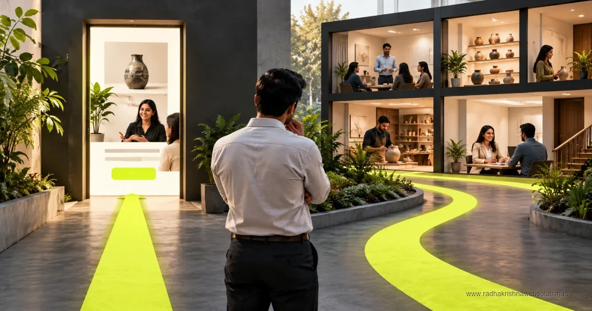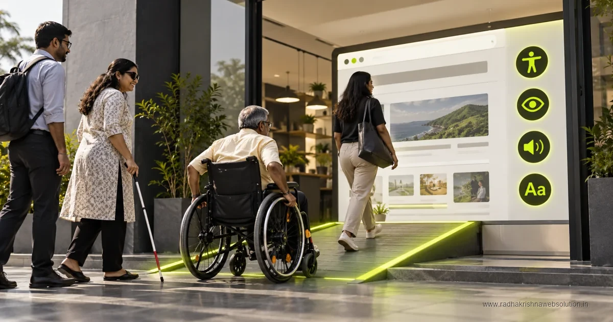
Website accessibility means making content and interactions usable by people with different abilities and assistive technologies. Review keyboard navigation, headings, contrast, labels, alternatives for images and form feedback. Use WCAG as a reference, combine automated checks with human testing and prioritise problems that prevent visitors from completing important tasks.
An accessible website helps every visitor read, navigate and enquire with ease, including older users and people using screen readers. If you are improving your site, our website redesign checklist and website maintenance checklist are useful starting points alongside this guide.
Why Accessibility Matters for Indian Businesses
India has a diverse online audience with different devices, languages, internet speeds and abilities. A manufacturer in Vadodara may get enquiries from site engineers on mobile, while a clinic in Pune may serve senior citizens who need larger text and clear buttons. Accessibility makes these interactions smoother for everyone.
It also supports business results. Clear headings, readable contrast and simple forms reduce confusion, lower drop-offs and improve trust. Search engines also prefer well-structured pages, so accessible practices often align with good SEO and user experience.
WCAG Basics in Simple Language
Web Content Accessibility Guidelines, or WCAG, are widely used principles for inclusive websites. You do not need to memorise the full standard to start. Focus on four simple ideas that cover most small business needs.
Content must be perceivable and understandable
Text should be readable, images should have useful alternatives, and videos should have captions or summaries where possible. Avoid light grey text on white backgrounds and keep language simple, especially for service and pricing pages.
Site must be operable for all users
Visitors should be able to use your menu, forms and buttons with keyboard as well as mouse and touch. Keep navigation consistent, give enough spacing for tap targets, and avoid elements that flash or move too quickly.
- Perceivable: Good contrast, readable fonts and alt text for important images.
- Operable: Keyboard-friendly menus, clear focus states and large tap areas.
- Understandable: Simple headings, labels and error messages in plain language.
- Robust: Clean code that works across browsers, devices and assistive tools.
Practical Checklist You Can Apply Today
You can improve most SMB websites without a full rebuild. Ask your team or your website development partner to review these points during the next update cycle. If several problems appear together, check the signs your old website needs a redesign before patching them one by one.
- Check colour contrast for headings, buttons and body text on mobile and desktop.
- Add meaningful alt text to service images and avoid text inside images alone.
- Label every form field clearly and show helpful errors near the field itself.
- Keep heading order logical with one main heading per page followed by subheadings.
- Make phone and WhatsApp buttons easy to find and tap on small screens.
- Test with keyboard only to ensure menus and popups can be closed easily.
Inclusive Design and Privacy-Friendly Thinking
Inclusive design also means respecting user choice and privacy. With growing awareness around data protection in India, keep consent simple and transparent. Explain what data your contact form collects and why, and avoid dark patterns that push users into actions they did not intend.
This approach builds confidence, especially for hospitals, institutes and financial services. If you collect enquiries through custom forms or portals, our software development process includes clear consent, role-based access and basic audit practices. For ongoing lead generation, accessible landing pages also improve digital marketing performance.
| Common Issue | Simple Fix | Priority |
|---|---|---|
| Low contrast text | Use darker text and test on mobile sunlight view | High |
| Images without alt text | Write short descriptions for informative images | High |
| Unlabelled contact form | Add visible labels and clear error hints | High |
| Small buttons on mobile | Increase size and spacing for easy tapping | Medium |
When to Get Professional Help
If your site has many pages, online payments, booking flows or older templates, an expert review can save time. A professional audit usually covers templates, plugins, PDFs and third-party scripts that affect accessibility and speed.
Start small by fixing high-traffic pages such as home, services and contact first, then extend improvements across the site. Regular checks after each major update will help you maintain progress without heavy rework.
Want a practical accessibility review for your business website? Talk to RadhaKrishna Web Solutions in Pune. Visit our contact page or call +91 70962 91214 to plan simple, budget-friendly improvements.
What Accessibility Fixes Cost and How Long They Take
Most accessibility work does not need a rebuild. Contrast corrections, alt text, form labels and heading order can usually be completed within regular maintenance. For larger redesigns that include accessibility, plan with standard Indian budget bands. Brochure sites are usually under Rs 50k, business sites are Rs 50k-2L, ecommerce builds are Rs 2-5L, and fully custom work is above Rs 5L. Timelines for proper design and testing are usually 6-12 weeks depending on pages and feedback speed.
Start with home, services and contact pages, then extend to the rest. For budgeting help, see our notes on website development cost in Pune and how long it takes to build a website. If you are deciding who should do the work, our guide on freelancer vs agency for a website build explains support and testing differences.
Common Accessibility Mistakes on Indian SMB Websites
The most frequent issues are light grey text on white backgrounds, contact forms with placeholders instead of labels, and vague errors like invalid input. Menus that work with a mouse but not a keyboard, PDFs without readable text, and phone numbers shown as images also block many users. Auto-playing sliders and popups without a clear close button cause further difficulty, especially for older visitors and mobile users.
- Text inside images: Offers shared only as images cannot be read aloud or searched.
- Small tap targets: Call and WhatsApp buttons placed too close cause wrong taps.
- Missing focus states: Keyboard users cannot tell where they are on the page.
- No video summaries: Demos without captions exclude many viewers.
Simple Checklist for Redesigns and Maintenance
Share this list with your designer, writer and developer before launch and repeat it quarterly. Test contrast on mobile and desktop, write short alt text for informative images, and confirm every form field has a visible label with clear error hints. Keep heading order logical, ensure popups close by keyboard, and verify call buttons on real phones.
- Design: Check contrast for text, buttons and footer links.
- Content: Add alt text and plain-language headings.
- Forms: Use visible labels and specific error guidance.
- Documents: Offer key PDFs as readable HTML pages also.
Pune and Vadodara Examples That Show Small Fixes Work
A clinic in Pune improved appointment enquiries by increasing font size, darkening body text and placing a large tap-to-call button on mobile. No rebuild was needed. A manufacturer in Vadodara cut its enquiry form from nine fields to five, added clear labels for drawing upload, and rewrote errors in plain words. Site engineers on mobile submitted complete enquiries with fewer mistakes. A coaching institute with centres in both cities added proper headings and alt text, helping parents find fees and batches faster. Start with readability, forms and contact actions, then extend the same care across remaining pages.
Testing need not be complex. Open your key pages on a mid-range Android phone, check readability in daylight, and try completing your enquiry form using only a keyboard. Ask a family member or staff member who is less comfortable with technology to find your contact details and pricing. Where they pause or struggle, simplify wording, increase size or improve spacing. Record these checks in a shared sheet so every festival offer or new service page follows the same standard.
- Simple language: Short sentences help visitors using translation tools and screen readers.
- Consistent buttons: Use the same style and position for call and enquiry actions.
- Regular review: Re-test after plugin updates, new banners and content uploads.
Over time, these small habits reduce support calls, improve form completions and build trust with customers who value clear and respectful communication.
Official references and further reading
Frequently asked questions
What is website accessibility in simple terms?
It means your website can be used easily by everyone, including older users and people with visual or mobility difficulties, across mobile and desktop.
Do small businesses in India really need accessible websites?
Yes, because clear navigation, readable text and simple forms help all customers enquire faster and build trust, while also supporting better search performance.
How do I start making my website accessible?
Start with contrast, alt text, labelled forms and logical headings on key pages, then review keyboard use and mobile tap targets during regular maintenance.
How much does it cost to improve accessibility in India?
Small fixes fit within regular maintenance, while full redesigns follow standard bands of under Rs 50k for brochure, Rs 50k-2L for business, Rs 2-5L for ecommerce and above Rs 5L for custom work, usually over 6-12 weeks.